Monday, December 31, 2007

Marc - V.R.D.

Just recently found another few Merckx sponsored teams. First up is Marc-V.R.D., starting in 1980! Might have been the first Merckx sponsored team.


Their frames looked somewhat similiar to the above. Marc teams continued to use Merckx frames for a couple of years, but I haven't found any decent pictures to indicate what they looked like.

In 1985, Tönnisteiner roade Merckx frames. Here's a black and white picture of Filip Cottenies. In this picture, you can just make out someone (might be Cottenies, I'm not sure) on a white frame with a red head tube and read seat tube panel.

Sunday, December 09, 2007

Motorola Scans

I've been combing through various magazines and books, scanning pics of Motorola team riders, to try to lend a hand to Randy Dugan, who owns Michel Dernies former team frame. He's built it up with an eye towards accuracy for how it was likely to be equipped in the 1993 racing year. Extremely cool bike, and the source of extreme envy on my part.

I haven't found any Dernies pics yet, but I've found a few cool pics that I thought some of you might be interested to see. Here's one.


Max Sciandri on his way to winning the Kellogg's Tour of Britain in late 1992. Pretty sure he's riding an early MX Leader, based on the fork crown, size of tubes, etc.

Sunday, December 02, 2007

Mavic 631 Triple

While I haven't written about anything Mavic in a while, my love for the quirky stuff they produced is still strong. Good or bad, their products always displayed a uniqueness that I really like.


The 631 crank is unique in its aesthetic, but the thing that really sets it apart from other cranks is it was designed to be used as a single, double or triple crank. As a single, the original design allowed you to run down to a 48t outer ring, though a redesign in the early 90's (94 perhaps?) allowed for a 44t outer ring.


When used a a double, spacers are used to seperate the outer and inner rings.

Things get interesting when using the 631 as a triple.


A third ring carrier replaces the spacers normally found between the outer and double-inner ring. The middle ring is bolted in place as the inner ring normally is followed by the 74mm BCD inner ring


Et voilà, a triple. Where a 631 double was designed for a 113mm bottom bracket, the triple uses a 119mm.

Tuesday, November 20, 2007

La Vuelta 1986

Here's a cool picture of two of the teams riding Merckx frames in 1986 -- Kelme and Panasonic.


From Winning magazine, June 1994. It was one of two pictures meant to illustrate the ever interesting topic of shoes in the peloton. I'll post the matching picture, which shows the 1994 peloton and their shoes (and another pair of Merckx teams) shortly. Enjoy!

Tuesday, November 06, 2007

The Syncro Rainbow

Its no secret that I have an unhealthy love of quirky, late 80's/early 90's bike stuff. In my drive to corner the market in obsolete shifters, I've amassed a pretty scary amount of Campy Syncro equipment. Shifters, unlike frames, are small and easily hidden from the prying eyes of those who'd question my strange obsession. Good thing too.

I recently came across a Syncro article in the Summer 1988 Record News, a news letter put out by Campagnolo USA in the 80's. Some interesting information in there. It confirmed the existence of 2 yellow insert variants, and maybe gave a little more clarity on what inserts work with what. Maybe. Still no listing for the Croce d'Aune small cage with 6 speeds that makes any sense. Good job guys!

Here's a little pictorial of the Syncro inserts.


The yellow "6V" insert.


The yellow "C" insert.


The blue "7V" insert.


The white "B6" insert. Sorry about the plastic.


The black "B7" insert.


The red "A6" insert.


The green "A7" insert.


Thats all of the 6/7 speed inserts, except the grey "7V" one thats used for Croce d'Aune in 7 speed. That seems to be the only one thats ridiculously hard to find. If you have one, you really ought to send it to me - I promise to give it a good home.


The yellow inserts are pretty close to being the same, except for a very subtle difference in the 5th gear, and a more pronounced one in the sixth. I suspect the differences become more apparent in freewheels that aren't tight-ratio'd.

Thursday, November 01, 2007

A Tale of Two Cities

I have a pretty nice collection of team jerseys, if I do say so. A few (ok, 5) of them are various Merckx sponsored team jerseys. One of them is newly acquired, and is an interesting one to me, at least.


The above is the normal, common Eddy Merckx jersey. I thought this was the design used in 1985 + 1986 Eddy Merckx sponsored teams (scroll down a little), which I'm pretty sure were cyclocross only. Most sites have 2 teams listed -- one being a Belgian team, notable for having Roger De Vlaeminck in the very end of his career, and the other being a Luxembourg team, which seems to have been an amateur team. The above isn't an exact jersey, but its pretty close. The rainbow colors aren't quite the same, but the Eddy Merckx lettering is the same -- seems like a general consumer version of a team jersey. Ok, great, makes perfect sense.


The skyline on the back of the jersey seems to be Brussels -- the tallest building sort of looking like the Grand Place. The little seal which seems to depict St. Michael stomping on a dragon works too, being part of the seal of Brussels.


This jersey, however, is something of a mystery. Its an old-style label, Giordana jersey. It has the textured inside, thats composed of loops of thread, that you saw in nice jerseys in the mid-to-late 80's. High collar. The Eddy Merckx lettering is straight across, instead of over/under. It contains a full array of sponsor logos -- aside from Merckx, there's Diadora, Campagnolo, Pronto, and on the collar...


G.C.V.C. Or maybe thats G.C. V.C. Something-something venture capital? velo club? Beats me. Not so sure on what Pronto is either...


No clue what city's skyline this is. A very boxy city, with a building that looks little like a syringe (whats with the weird lightning, glow worm thing?), and one that looks like the Empire State building.

What is this jersey? The proper 85/86 Merckx team jersey? Some small club or shop team? One of the myriad of Belgian trade teams? What skyline is that? Is anybody out there? Help!

Tuesday, October 30, 2007

Yay for me, boo to all of you

Here's another Merckx team -- Capri-Sonne


Yep, Capri-Sonne, known here in the US as Capri Sun, those funny little silver juice pouches from the early 80's, that apparently are still around. Who knew?

They rode a silver frame, as seen a little better here. Calling some of these solid colors "team colors" is pushing it a bit, but it fits my criteria. Too bad I'm the one who found it, otherwise someone might have found themselves with a nice, 100% free jersey. Still plenty of teams out there to identify, and a couple of days to do so...

Sunday, September 23, 2007

The Tears for Gears Merckx Team bike challenge

So as I noted in my last post, there are probably a ton of Merckx team frames I know nothing about. There are some main stream(ish) teams I haven't been able to track down, and dozens and dozens of continental teams I've never heard of, let alone seen a picture of.

There are also a couple of frames I suspect are team frames I've just never been able to figure out, including


and


So here's the challenge. The person who can find and identify the most Merckx team frames which I do NOT have not talked about in my blog posts or in the serial list will win a prize:


A Euro Trafic Merckx team jersey. Its not a new jersey, its actually a former team jersey, so it has some wear and tear, but I bet no one else will show up at your next club ride wearing one! I'll pay shipping and everything...all you have to do is follow some simple rules...

I'm looking for more teams riding Eddy Merckx bikes from 1980 through about 1998. This primarily means steel frames, built in the Merckx factory in Belgium. To positively identify a Merckx team color scheme, you need only send me a clear picture of a team rider on the frame that shows the primary details of the color scheme. A team color scheme means that the whole team rode/rides that scheme. If there's a color scheme i've missed for a team I've already identified, that counts -- I bet there's at least 1 other Kelme. I'll set a deadline of November 1, 2007.

You can send me info at merckxteams AT tearsforgears DOT com. The two frames above are a decent place to start -- that I can't ID them is driving me crazy. The top is from 1986/87, and the bottom from 1988/89. Good luck, and send me what you have! If you're the only person to respond, you just may win!

Still no new teams sent in! All it takes at this point to walk away with the super cool jersey above is identifying one new team. That's it! I'll mail the jersey anywhere in the world, postage paid for by me!

The last of the Merckx team frames...

Wow, today is going to be a 3 post day. I figure, before my little challenge can begin, I need to put out the last of the team frames I know about up. Without further ado...


The United States' first team to make it in the pro peloton ranks, 7-Eleven! After years of having their downtubes sullied with Huffy and Murray decals, they switched in 1989 to Eddy Merckx frames for their final two seasons.

In 1990, 7-Eleven folded and was reborn as...


Motorola. The above is Michael Dernies' team issue Motorola Merckx, in Columbus TSX. Motorola is best known by many as the team Lance Armstrong rode for when he won the worlds in 1993. Here's a picture of Michael Dernies on his Motorola Merckx. Maybe its the same one (or maybe not).

OK, we're on a roll. Here are some of the Merckx riding teams in the last years of steel:


In 1996, Gan rode blue MX Leaders and Arcabaleno's, as you can see in this picture. In 1997, they switched to white frames, that look like steel -- . If they were riding steel in 1998, I'd be pretty surprised.

And contrary to what I thought, they were riding white Arcabaleno's as late as 1998


Vlaanderen 2002 rode yellow MX Leaders, as seen here, here, and here.

Finally, it looks like S.E.F.B. Spaarbank rode the same colors as Domex/Weinmann in 1989.

So thats all of the Merckx team frames I've found. There are a few I know I'm missing, including IPSO/Euroclean, Hueso, Westwood...I know someone out there knows a couple of those. With my next post, hopefully I'll motivate some of you to lend me a hand.

Telekom and Kelme Merckx Team Bikes

The procrastination has gone on long enough! It's time to publish my next installment of Merckx team bike frames. Let's go!


Telekom used Merckx frames from 1991-1995. The above is the color scheme I most associate with Telekom -- you can see it in this team photo from 1994.

What you might not know is, in 1995, Telekom changed its name to Team Deutsche Telekom, and changed its bike color scheme to the one you can just make out in this picture of a young Jan Ullrich. Its a pink head and top tube, with purple points. Its more or less as if they flipped the colors on their previous scheme, and called it new. At least they didn't have to change their jersey colors. They shifted to Pinarello frames in '96, so this color scheme only lasted a year -- so if they were available to the public, it would have been a pretty short time frame.

OK, its Kelme time. Given how long Kelme was around, you'd think I'd have seen more examples of bikes in the public sporting Kelme colors, but you'd be wrong.

In early years, Kelme rode an all white frame, as seen here, as well as a all blue frame, as seen here.

In 1985 and/or 1986, Kelme used the same red/pink/white frames that Lotto and Teve Blad did, as seen here.

In 1987, they switched to what I think is a pretty awesome color scheme, seen here, that matched their jersey's perfectly. I think they kept this frame through 1989.

At some point, for reasons I can't fathom, they switched to this color scheme. The switch was in either 1990 or 1991...I can find pictures in this scheme that I'm sure are 1991, but I haven't found any good shots of a rider on one wearing the Kelme/Ibexpress jersey from 1990. Anyhow, the color scheme looks a lot like Telekom, but with a green bottom bracket and rear triangle. Its fine, but its no '87-89 color scheme if you ask me. Not that you did.

Next team post will cover the 7/11, and two of the last pro teams that Merckx sponsored on steel, Motorola and Gan.

This post is a little light on the eye candy...so light in fact, that later tonight I'm going to post a CHALLENGE! With a really excellent prize! Stay tuned...

Wednesday, September 12, 2007

Still more Merckx team colors...

Still hanging in there? Only 10 or so more teams to go! And this post is going to be a big one...


Panasonic seems to be primarily thought of as a Raleigh team, but in 1986, they were riding white with blue points Merckxes.

The color scheme was a popular one. Another top pro team got the same color scheme, relabled as Caloi, in 1993/1994...that team being Lotto.

Speaking of Lotto...those guys rode quite a few different Merckx color schemes.


No, not all of the above! In 1985, they rode a yellow with white panels color scheme, as seen in this team photo. To be honest, I'm not sure they used the font in the picture above. It's possible it was the same font that...

Europ Decor rode in 1984. Prior to that, they rode blue metallic with white panels.

Back to Lotto. In 1986, they moved to an all red scheme, and kept it (I think!) through 1987. The only thing that differentiates it from the normal stock frames is that the seat tube has vertical Eddy Merckx lettering, while bikes for us mortals just had the EM logo and the France/Italy world champ bands. Here's a mediocre picture where you can see what I'm talking about.


In 1988, they moved to the above, red and white, pointed scheme, as seen here. And in 1989, they moved off Merckx bikes, and on to Vitus.

Michel Dernies seems to have ridden on teams Merckx sponsored for all but the earliest years of his career -- starting in 1985 for Lotto, to Domex/Weinmann in 1989-1991, to Motorola through 1995. Being from Belgium, I guess its not that odd, but I thought it was worth noting. It also has nothing to do with team paint schemes.

Remember that red and white pointed bike I was talking about before that nonsequitor? Well, it was also ridden by Teve Blad, in 1986 and 1987. I highly recommend looking at the pics of their riders -- they did a photoshoot that makes them all look fairly ridiculous. I have no idea what color frames they rode in 1985, so let me know if you do.

Wow, I'm tired! I know I promised Kelme in this post too, but its too much! Panasonic, Lotto, Europ Decor and Teve Blad, combined, rode 5 color schemes. I think Kelme rode at least 3, possibly 4, so they have to wait. I'll get to them in the next post, along with Telekom.

Monday, September 10, 2007

Merckx Rebranding (and another team frame)

Yes, yes, I promised the next post would be more team bikes, but sometimes a guy gets busy, and can't get things together for a proper post.

Luckily, someone who read one of my previous posts sent me me interesting catalog scans. Michele lives over in Sweden, and was the person who let me know that in his area of the world, the Stuttgart color scheme is also know as the PK-Banken scheme. He owns a stunning example of a frame in the same color scheme, fitted out in full Croce d'Aune. He has a few other bikes that are really nice as well.


He sent along this scan from the 1990 Crescent catalog. In it, you can see a Crescent AND Merckx labeled frame in the Stuttgart/PK-Banken color scheme, ridden by Jan Carlsson, who I'm told was the Swedish time trial champion.


In the same scan, you can also see a blue and white fade Merckx. The same color scheme was used by...

Intral-Renting in 1988.

He also sent along a scan of a relabeled Merckx frame from the 1989 catalog...but since its the same color as the frame of 2 teams we haven't discussed yet, it'll have to wait...

Monday, September 03, 2007

More Merckx team bikes...

First up, we have the La William team from 1989. They rode a yellow and blue frame, with a lighter blue point. I've never seen one. I have no idea if the scheme was ever available to the public. Anyone have one?

Domex/Weinmann, and later just Weinmann, were responsible for 2 separate team liveries.

The Domex/Weinmann team frame was a pretty attractive one, in white and blue, with orange accents. While the team photo, in black and white, is entirely useless, a picture here shows it off nicely. Strangely, however, my serial number database doesn't have any examples. I'm almost positive, however, that I've seen them. Do you have one? How is it you haven't sent me pictures and your serial yet?!


In 1990 and 1991, Domex and Weinmann split up. The Weinmann team continued on Merckxs, in a new color scheme, as seen above. To go with the worlds ugliest jersey, they settled on a color scheme that, strangely, works. Course, I'm the guy with the purple and orange blog color scheme, so take that opinion with a grain of salt. For those of you who don't believe anyone would match hot pink with neon yellow and purple, here's just one sample of a team member in a publicity shot. They all look equally confused at how a color blind person managed to design their color scheme.


I finally found evidence of what I've suspected -- that the Weinmann color scheme in 1990 is a little different. You can see it above from a Crescent catalog. It lacks the pink rear triangle and bottom bracket areas, and reverses the green and pink in the points -- as seen here.


You may be noticing, I'm a big fan of de weilersite, aka cyclingwebsite.net for those of you who, like me, don't speak dutch, as well as hour.be. I don't speak flemish either, but the list of teams can be found here, and riders here.

Next up, we'll shift to some of the pretty well known teams: Lotto, Kelme and Panasonic.

Saturday, August 11, 2007

Merckx team bikes

In the mid-80's through mid-90's, Merckx sponsored a number of professional cycling teams. Each had a specific color layout for their frames. Some of them are very familiar -- the purple and pink of Telekom, the red and green of 7-11, while some of them are a little less familiar. Here's a list of the ones I've documented. Where there are examples in the Merckx serial list, I show a picture. Where I don't have a sample frame picture, I'll link to a picture of a team member astride one. I'll post a few color schemes each day. I'm lazy like that.

Its worth noting that some of the team livery frames were ridden by multiple teams, seperated by a few years...in at least one case, 7 years.


ADR, from 1988. You can see a picture of Eddy Planckaert astride one here.


Team Stuttgart, 1989 and 1990. Here's a picture of the entire team. These guys went on to form the basis of Team Telekom in 1991. Kinda makes you wonder just whats in that puma bag in the picture...

A reader was kind enough to drop me an email, letting me know that in Sweden, this color scheme was associated with the PK-Banken semi-professional team. We'll see another example of this with a different color scheme, where the second team rode the same frame labeled as a Caloi. Any guesses on the teams?


Team Hitachi, 1988/89. Claude Criquielion riding his, in the 1988 TdF.

Next post, I'll cover the Domex/Weinmann team frames (there are a few), and La William. Exciting, no?

Thursday, June 21, 2007

Syncro Tips and Tricks


I've had a few people email me looking for some insight on setting up Syncro shifters. I don't claim to be all knowing on the subject, but I have had some success based on info I've read, as well as a couple of tricks I've picked up.
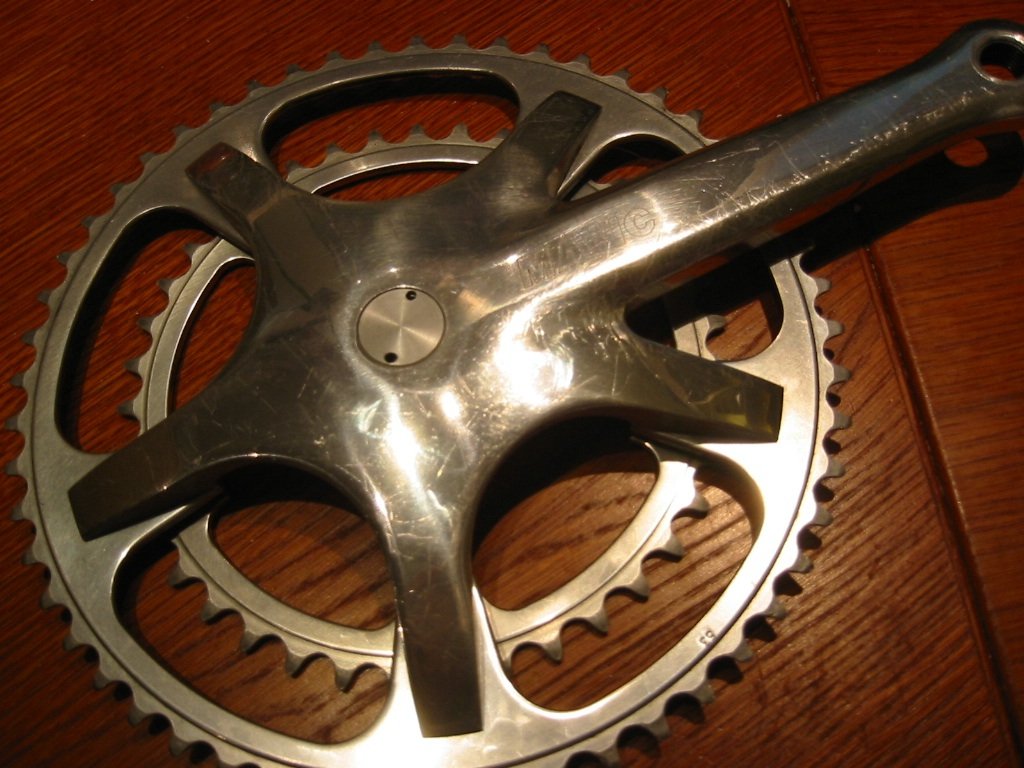
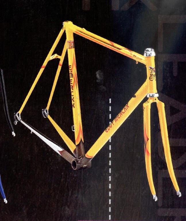
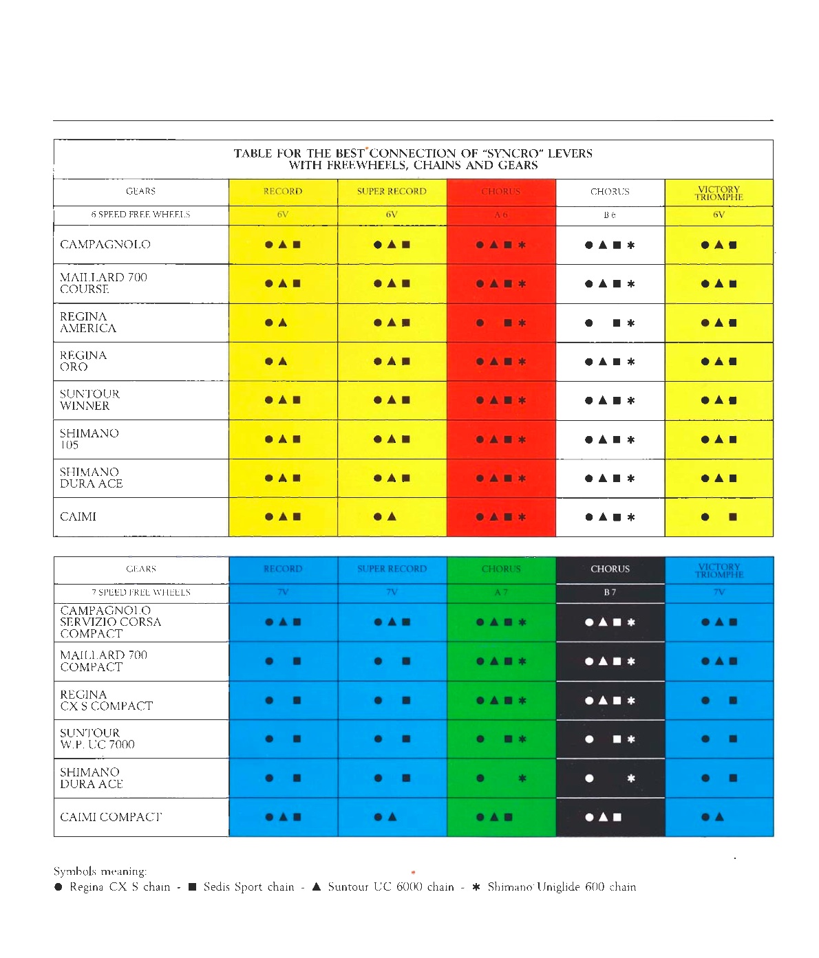
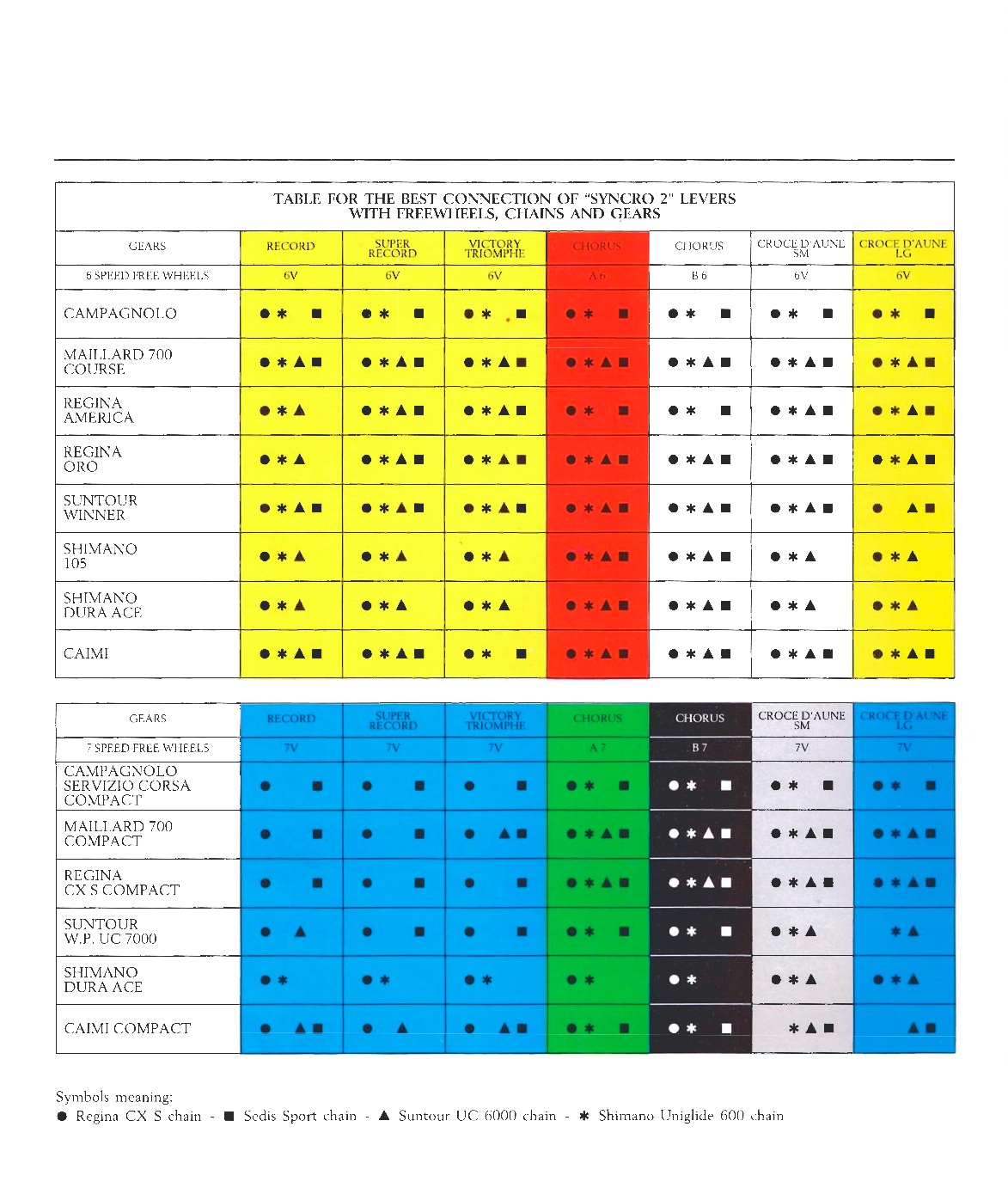
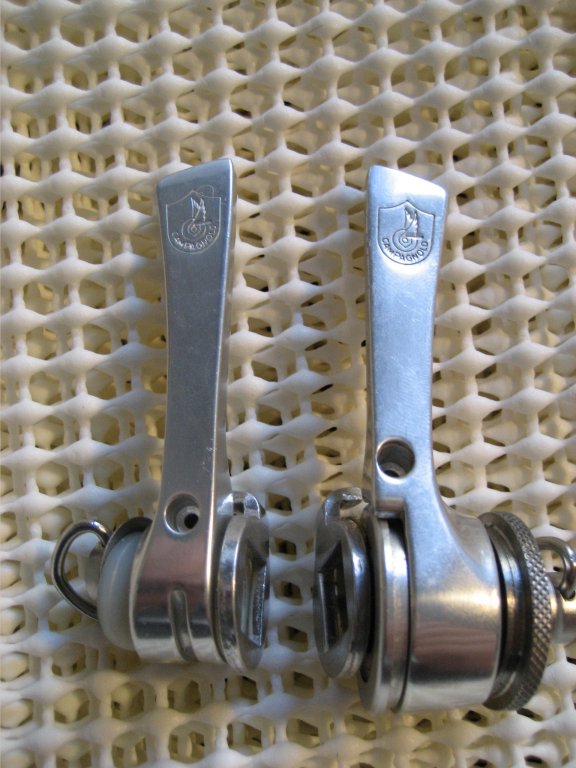
 
Syncro      Syncro2

First things first. The first thing you MUST do is consult the tables provided by Campagnolo with regards to what combinations of freewheel, chain, dérailleur and shift collar work together. Yes -- the different colors of collars can be hard to find. In some ways, I'd suggest selecting your derailleur, freewheel and chain based on the collars you have access to. Some substitutions will work better than others, but unless you have lots of time and lots of spares, stick with something that Campy published as working. It can be hard enough setting up Syncro with the correct equipment.


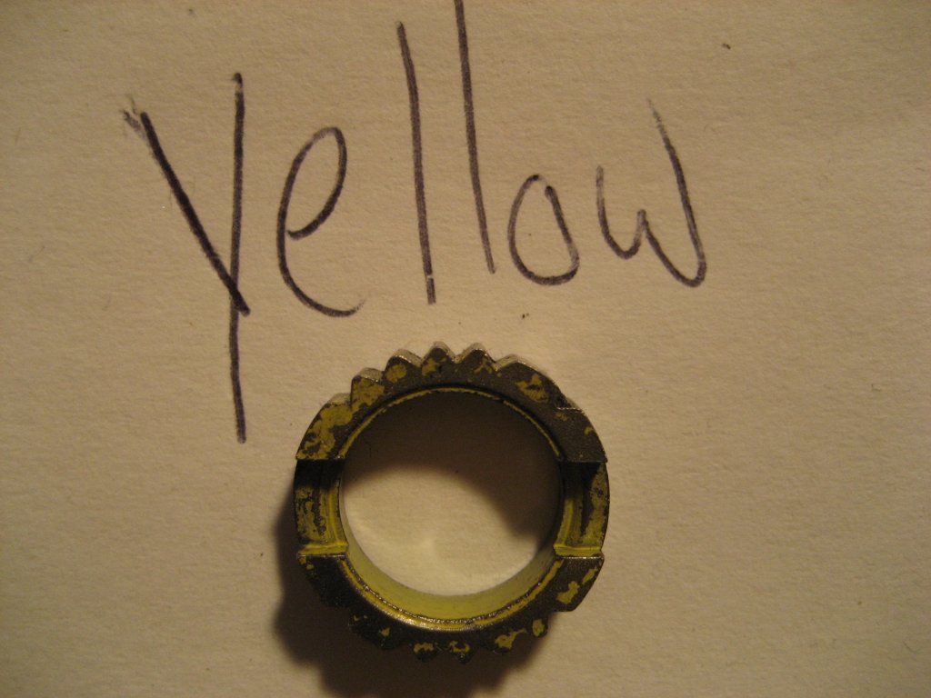
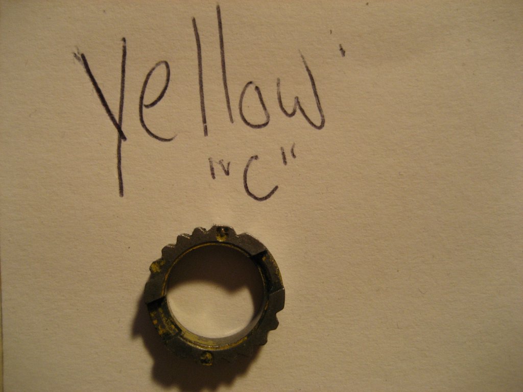
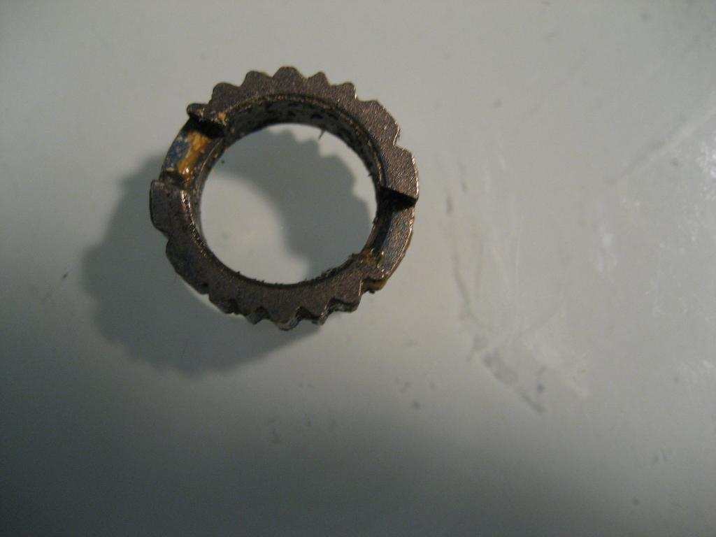
One tip I read that seems to help comes courtesy of a usenet post by Andrew Muzi over at 
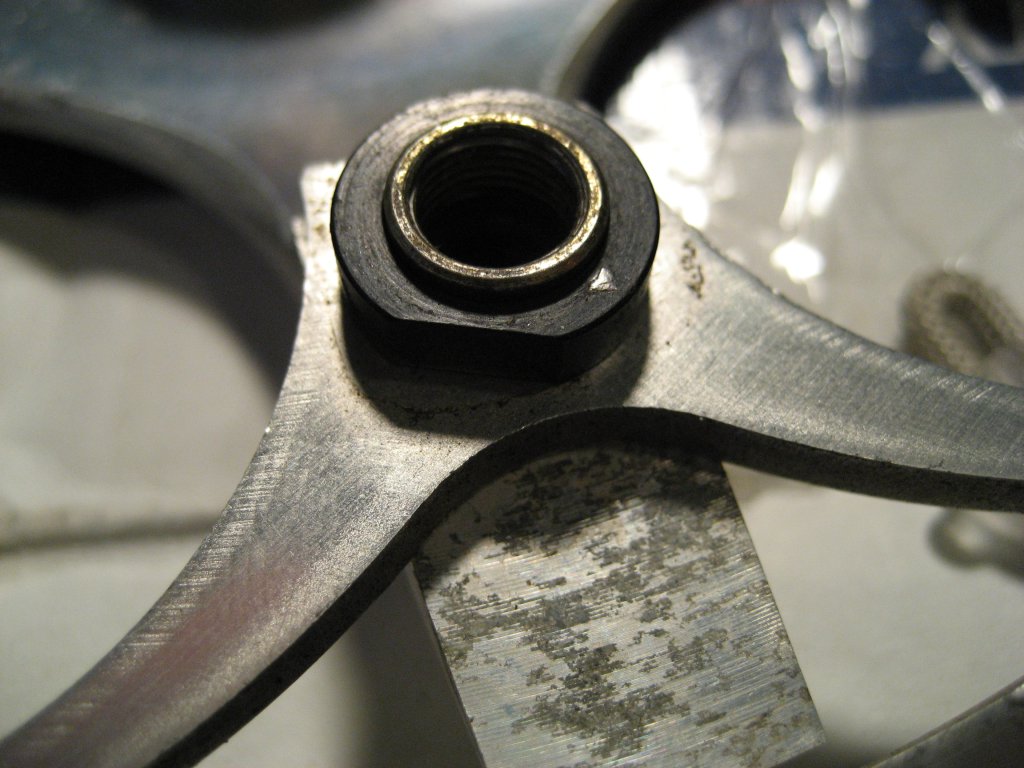
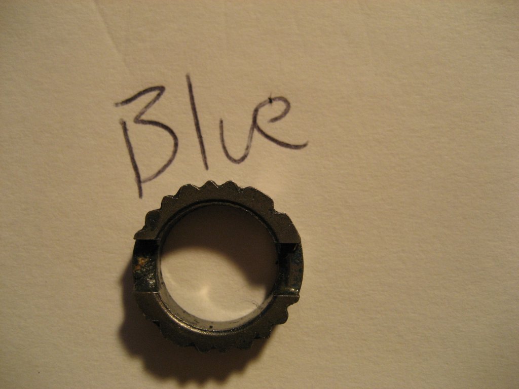
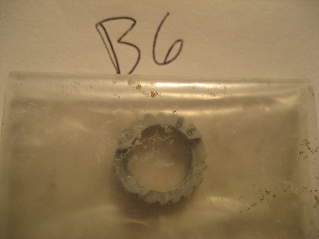
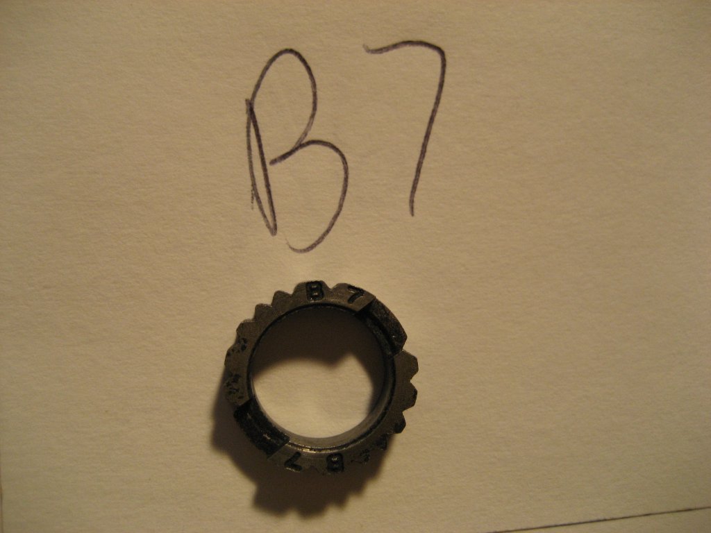
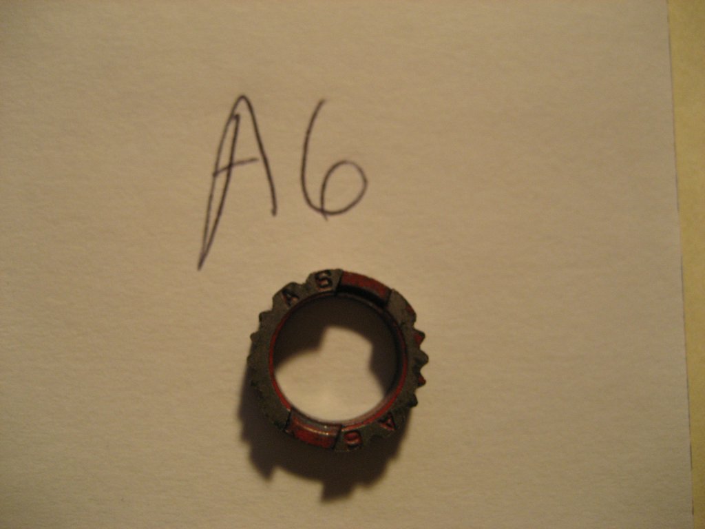
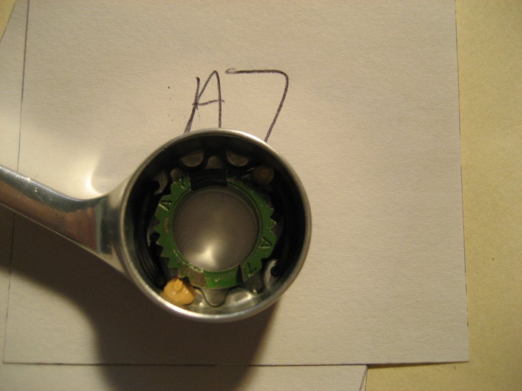
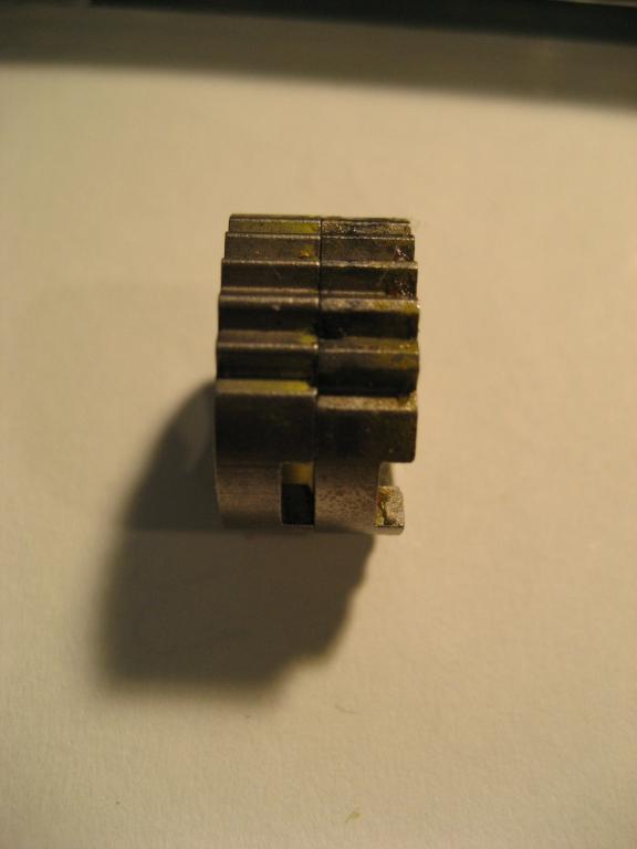
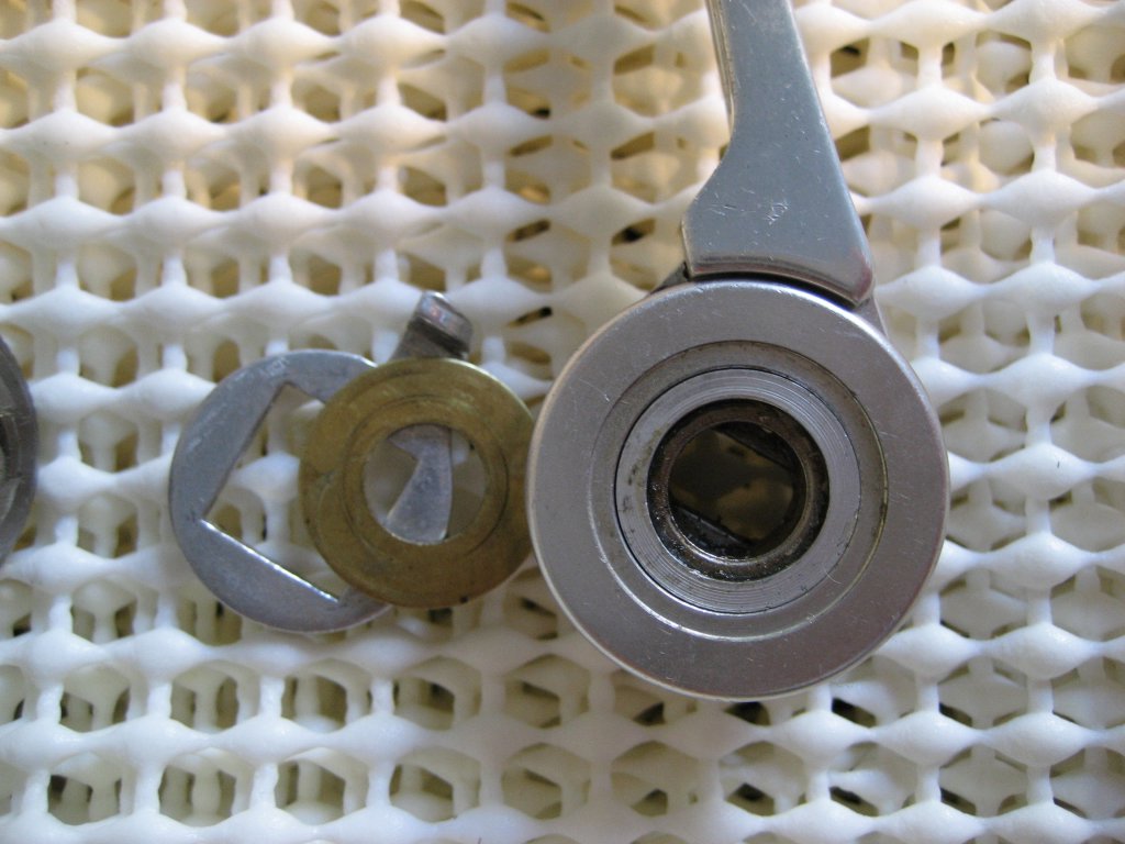
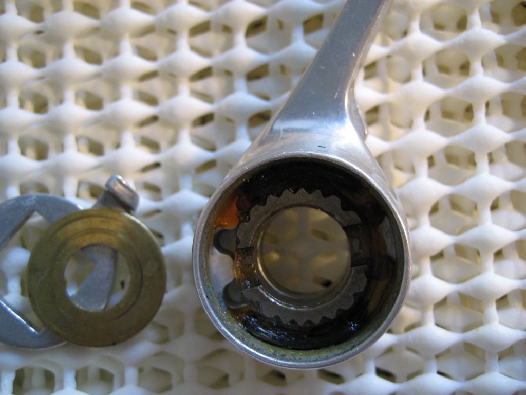
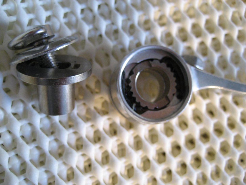
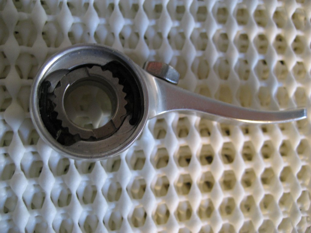
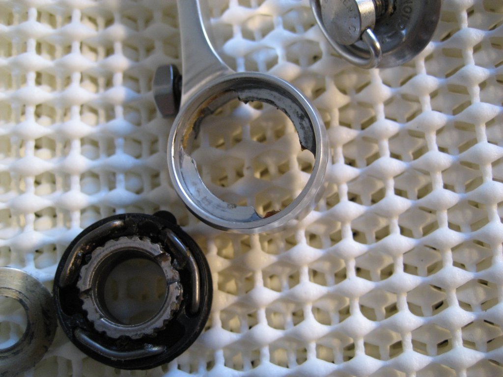
Yellow Jersey. He advocates artificially wearing the teeth of the shifter notched insert, using a buffing wheel. I used a dremel with a little bit of buffing compound, which also works. The goal is to take some of the square edges off the teeth of the collar. This eliminates some of the harsh edges you'll encounter when shifting, and make the whole system a little more tolerant of imperfect shifts. The above shows a slightly worn blue insert. Might be hard to see in the picture, but the tops of the notches begin to round slightly when they wear. The goal is to simulate repeated shifting, and eliminate any break in time for the shifter.

There are also some who advocate using a floating upper pulley -- similar to the kind you'd find in a modern derailleur. The bearing units tend to be more precise, and indexing systems can benefit from a little wobble as they're shifting. It provides a little overshift, to get the chain up on the next cog, and then lets it sort of float back to the appropriate location. Personally, I haven't had to resort to this, but it may make the system a little less finicky.


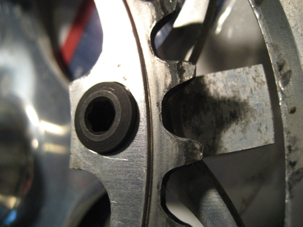
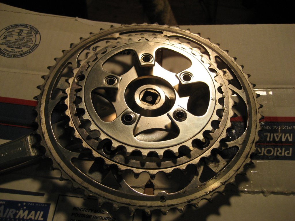
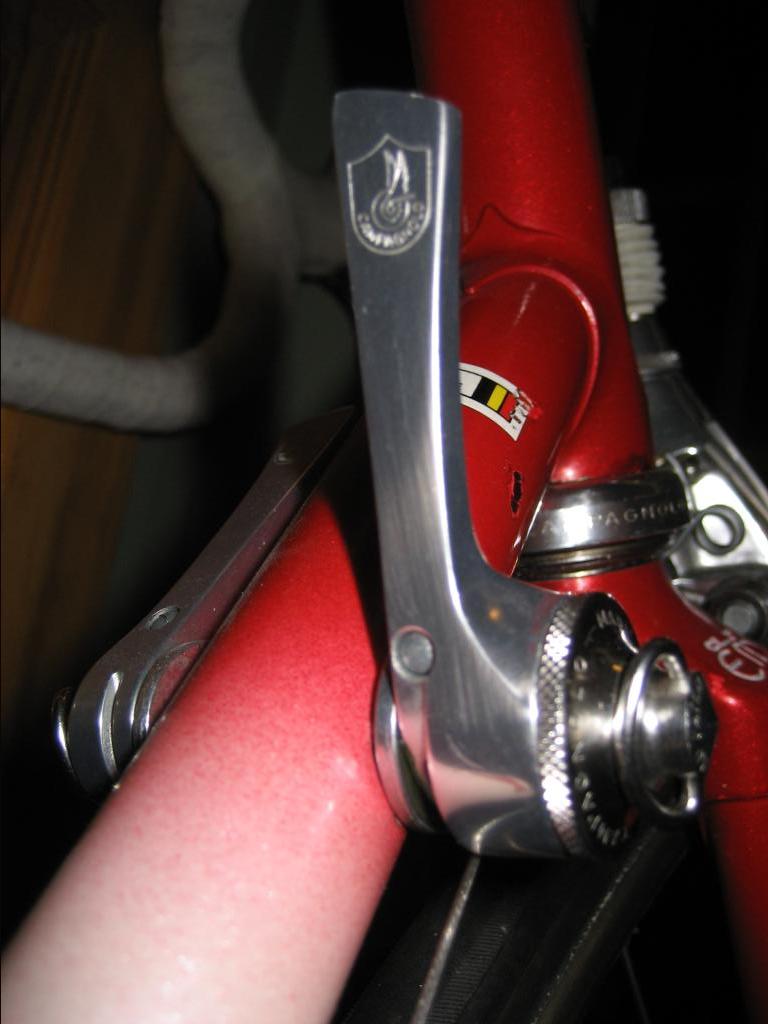
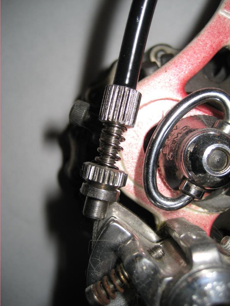
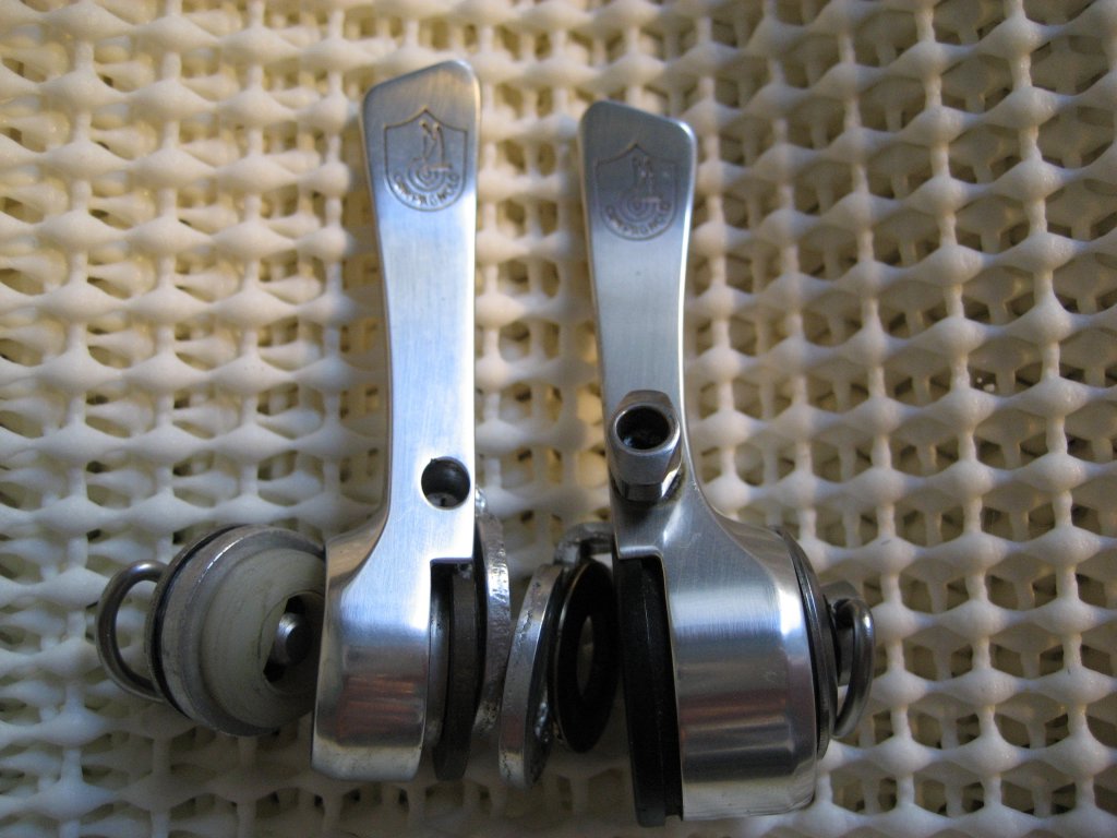
If your derailleur doesn't have a barrel adjuster, it should. Some Syncro shifter sets came with one, and once Syncro continued, derailleurs came with them. You need this for the fine-trim on your derailleur. The Campy supplied one is shown above, but you can cobble one together from your parts box.

One thing I've never read anywhere, but really seems to have a positive effect, is tightening the indexing lever more than you'd think. If you're used to modern indexing systems, you know the tension on the lever really has no impact on the quality of shifting. The tension isn't really all that adjustable. On the Syncro, however, having it snugged down further than you think seems to improve shifting accuracy immeasurably. If you hear a discreet 'click' when you shift, make them tighter! Mine make more of a thump sound when shifting...If you're used to friction levers, you will not end up tightening the indexing lever enough. Don't strip anything, but don't be shy either. I think this is related to the 2 springs not providing support for the insert when not tightened down (hence the eventual move to a much much better 3 spring version post-95). Just be careful -- I've seen cracked inserts before.

Use modern derailleur cables. They don't have as much stretch in them, and that seems to be a good thing. The use of linear cable housing may also be a wise thing, although I have to admit -- I'm using spiral housing successfully.

My setup works beautifully, if I do say so myself. I do *not* have to overshift, which was a common complaint with these. I think the wearing of the collar, in conjuction with the tight indexing lever makes all the difference. Curious about my setup? I use a Croce d'Aune derailleur, Regina Oro freewheel, CX chain and the yellow collar with Syncro 2 levers.

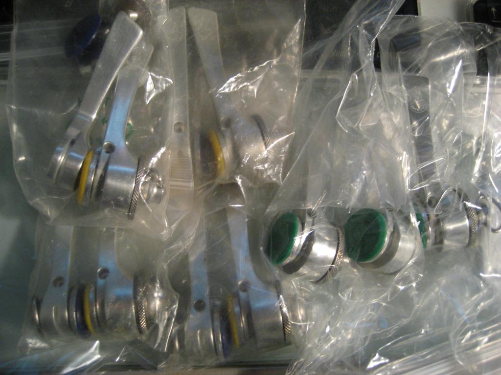
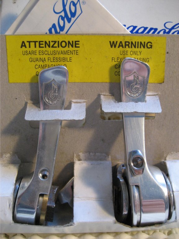
Here's a gratuitous picture -- a pile of NOS Syncro II's. Its all part of my effort to corner the market in obsolete, inferior technology.

Friday, May 11, 2007

The last gasps of Syncro

When people think of Syncro shifters, they tend to think of 2 versions. The original version, with the little lever on the side, and then Syncro 2, which I detailed in an earlier blog post. That really doesn't show the big picture -- the introduction of 8 speed cassettes and Ergopower didn't herald the end of the downtube shifter.


1991 saw the introduction of 8 speeds for us mortals. But in order to take up 8 speeds worth of shifting, without having to bend the lever past the downtube, some changes had to be made


A larger takeup barrel was added. But that was basically the only change made to the 1991 version. Flat shifter lever, and the identical innards to the Syncro 2.


1992 saw some more obvious changes to the shifter. The ability to switch between friction and indexed was done away with -- no longer could you pull out a collar and rotate it to disengage the indexing cog. The lever itself was curved, for your comfort.


The innards were also mildly changed, but the 2-spring arrangement of Syncro 2 remained. A small adjuster was added to the rear shifter to allow the "possibility of adjustment while racing" -- which is probably Campy speak for "compensate for our mediocre design while riding."

The left/front lever was also redesigned...but its still a friction shifter. Nothing too exciting there. If you're reading this with the hope of seeing it, just place a comment indicating you'd like to see it, and I'll add some pictures.


1995 saw the final redesign of the lever. Outside it looks fairly similar, but inside it saw a pretty significant change.


A insert contains all the shifting bits. A new 3-spring design was employed. The upside to this was better support around the collar, which gave improved precision to the whole mechanism.

This design still lives. Campagnolo discontinued downtube shifters altogether in 2001, but the same design is used for the 10 speed bar end shifters today. If you wanted 10 speed indexed shifters, you'd just need a set of stops, and a set of the bar end shifters, or a set of the 95+ shifters, and a 10 speed indexing collar.

Related Posts with Thumbnails